‘Modern British’
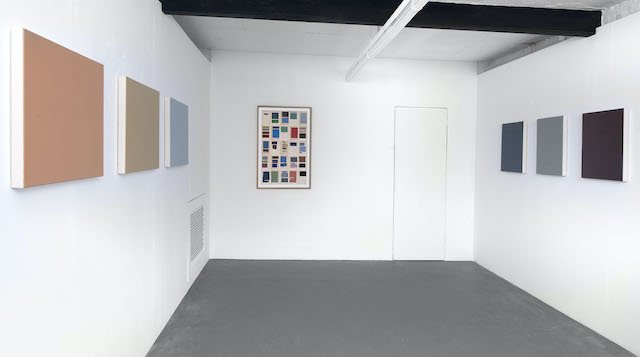
Installation shot my my exhibition at Art First, London.
After a couple of weeks of silence because I’ve been in England and now am in central France, in today’s post I write about my exhibition in London, which ends on 28th March.
As you can see from the installation view, in most of the works in the exhibition, what you first see is a coloured rectangle. Then, as you move closer, you make out a text written on the painted surface. This writing is almost the same colour as the ground of the painting and is built up in painted layers to produce a relief effect. The result is that the text stands out from the surface, casting small shadows. Once you are close enough to attend to the text, you can see it has been painted by hand, not printed. It is perfectly legible, and one can easily identify the source as a book cover or title page.

A photo of the second painting on the left. Stanley Spencer, 'Penguin Modern Painters’ (1947), 2023, acrylic on canvas, 53 x 66 x 4 cm. Below: A detail.


Installation shot of right side paintings. Below: details of the second and fourth paintings from the left . W.H. Auden, ‘Some Poems’ (1940), 2023, acrylic on canvas, 44.5 x 42 x 4cm, and Virginia Woolf, ‘To the Lighthouse’ (1927), 2023, crylic on canvas, 53 x 42 x 4cm.


My source books are works by British writers and about British artists selected from the first half of the twentieth century up to the 1950s. The choice I made of novelists and poets is quite random. They are W. H. Auden, E. M. Forster, D. H. Lawrence, Wilfred Owen, George Orwell, and Virginia Woolf. The choice of the specific books by these authors is also more or less random. Sometimes, they are personal favourites. The ‘Book-Paintings’ based on The Penguin Modern Painters series (published between 1944 and 1948) are very close to my heart because my father owned several, and they were one of the principal ways I learned about modern art. The one si have painted for the exhibition feature Stanley Spencer, Ben Nicholson, Paul Nash, and Victor Pasmore. There is also a painting based on the LP box cover of the first recording of Benjamin Britten’s War Requiem, an example of a tentative new series of ‘Album-Paintings’. I chose this particular composition because I wanted to make an uncomfortable link to the present; Britten had in mind the First World War, but wars today in Ukraine and more recently in Israel/Gaza are very much on everyone’s mind. Also, Wilfred Owen’s poetry is used by Britten, which links the music to one of the books I painted.

Benjamin Britten, ‘War Requiem’ (1962), 2023, acrylic on canvas, 30 x 30 x 4 cm,
There is also a work on paper from my ‘Paragraph-Painting’ series. In these, I directly paint with acrylic paint over paragraphs or verses of text or images on pages cut from books or magazines, and thereby produce what can be described as ‘ready-made’ geometric abstract art. The work shows all the pages of T.S. Eliot’s ‘The Waste Land’.

The Waste Land, 1922, 2021-23, acrylic on Penguin book page, 103 x 67cm. Below: a detail.

*
You could call my artistic practice a kind of cultural ‘remix.’ Whereas postmodern practices engaged in varieties of ‘appropriation’ in which there was a transfer of cultural signs from one sphere to another, in ‘remixing’ (a term most often used in relation to contemporary music but that is in fact a basic characteristic of digital culture in general), transfer involves a significant modification of the cultural sign. So, for example, while I don't much change the original layouts of the book designs, in migrating one medium into another I make considerable transformations in the source’s size, colour, and texture. As a result, the experience of my work is very different from the experience of the source.
Through the references to books, I explore painting’s status as a cognitive sign or code. I connect to a cognitively rich sphere that draws in associations and memories from beyond painting that relate to modern history and culture. But I also exploit painting’s noncognitive potential – its significance as a way of sending out or drawing in affective forces or energy. These qualities, which can make painting feel like a powerful presences, elude categorization or coding and are more about resonance or elusive interaction between the work and the viewer.
There aren’t many obvious traces of my hand on the surface of my paintings because I want to draw attention to my body as something silent and still, rather than in dynamic action. I find ways to diminish the telltale traces of my subjectivity and bodily presence. I suggest intimacy, and a contemplative mode of attention. The maker of the work has to somehow get out of the way.
When you look at my paintings you are being drawn to simple physical properties. These consist of basically two elements: colour and texture. Colour offers itself to the senses before it becomes something symbolic (for example, when red signifies danger). But colour is unreliable from a cognitive point of view, as it is always shifting and never remains the same. This is because colour perception is a property of the retina not of things. The colours I choose derive from multiple sources. They can be relate to the actual colours of the source book or image, prompted by a mood I associate with the source, from the specific season when and the place where I painted the work and so have nothing at all consciously to do with the book, relational, in that the colours are arrived at because they seem to work well with another adjacent colour, or can be arrived at intuitively.
I slow or delay the usual facility of language. I’m interested in the proximal view. In close-up seeing. I hope to draw attention to the porous boundary between the self and the world. As a result of the formal changes I introduce, the usual figure/ground contrast produced through the visual perception of the colours, images and letters on a book cover or title page is replaced by subtle variation in tone and texture. The contrast between the different elements is far less definitive than in the original figure/ground gestalt, and in fact is so unstable that at a certain distance it collapses altogether, and all you see is a one coloured rectangular ‘ground.’ My ‘figure’ seems to be absorbed into the ‘ground’ or to be emerging from it. Then again, the fact that the text on my paintings is rendered in relief, supplements the usual activity of seeing by engaging tactile values. This engages the ‘haptic’ dimension to perception. The term comes from the Greek meaning ‘palpable’ or ‘suitable for touch’, and refers literally to the ability to grasp something. The haptic requires engagement at close range and intimate physical contact and provides the brain with input from surfaces and information about direction and position, thereby providing greater intimate awareness than the distancing faculty of sight.
Because a viewer’s movements in relation to my painting surface determines whether they see just a coloured rectangle or a surface covered in text the status of my paintings seem to be transitive rather than static. The effect I aim to produce is of a kind of ‘in-between’, a shifting space where nothing is definitively fixed. Perhaps my special interest in evoking this ‘in-between’ is a consequence of having lived the first six years of my life in on the top floor of a block of flats directly overlooking the English Channel – a vast and ever-changing expanse of sea and sky.
*
This exhibition relates to one I did at Art First in 2007 called ‘The English Series’, and it is in a sense a continuation of the same theme. But since 2007 I’ve left the UK and now live in South Korea and France, so thinking from a distance about what it means to talk of ‘British culture’ has also played a part in making me want to create new works on this theme. Also, the Brexit farrago has happened and the Covid pandemic, both of which in their very different ways have shed light on what it means to be British in the early twenty-first century.
The Irish writer Fintan O’Toole has recently described the Brexit vote as being driven by British people’s “hysterical self-pity”. I hope this lamentable trait isn’t my nation’s outstanding one. Here’s the opinion of one of the authors I draw on in the exhibition, George Orwell, writing in 1941:
The gentleness of the English civilization is perhaps its most marked characteristic. You notice it the instant you set foot on English soil. It is a land where the bus conductors are good-tempered and the policemen carry no revolvers. In no country inhabited by white men is it easier to shove people off the pavement. And with this goes something that is always written off by European observers as ‘decadence’ or hypocrisy, the English hatred of war and militarism.
Orwell’s views were coloured by current events; he was writing as Britain stood alone against the very ‘ungentle’ Nazis. I’m not sure ‘gentleness’ would come to mind these days as a defining character trait of us Brits. But then again, it does seem that, comparatively speaking, we British continue to hate war and militarism more than many other nations. Our policemen still mostly don’t carry guns. Not that this has stopped our leaders getting Britain embroiled in various conflicts - Iraq and Afghanistan come to mind. But, paradoxically or perversely, perhaps they thought Britain was fighting precisely to defend the value of ‘gentleness.’

My painting after the first edition of George Orwell’s ‘Animal Farm’. 2023, acrylic on canvas, 53 x 42 x 4cm.
*
‘Presentism’ now holds sway culturally today. We live in a society in which the past is routinely interpreted in terms of today’s attitudes, values, and concepts, and as a result, is judged negatively. So, for example, in my exhibition there is only one woman, Virginia Woolf, and no people of colour. These absences are an accurate reflection of the dominant social norms of the period I cover, which are no longer those of contemporary British society. However, my intention is not to expose the sexist and racist prejudices of that time, nor to ignore them. I wanted to make paintings that celebrate British writers and artists and the culture they hoped to nurture, a culture to which I belong, albeit in attenuated and conflicted ways.
From the perspective of living in South Korea, I view the mounting critique of ‘Western values’ by the so-called ‘progressive’ Western cultural elite with amazement. From the roof of my house near the infamous DMZ that divides North from South Korea I can see the mountains of a nation whose people are deprived of even the most basic freedoms we take for granted. Despite all its many and obvious faults, we should be proud of our cultural heritage. I worry that in our avid quest to expose the failings of the past (and their lingering hold on the present) we risk throwing the baby out with the bathwater. In other words, we ignore or take for granted much of inestimable value, underestimating the fragility of the hard-won cultural freedoms we already enjoy.